Thursday, 16 March 2017

OUGD406: Evaluation and crit feedback

Crit feedback:


Evaluation:

The concept of this idea is to show Adrian’s normal struggles and lifestyle of a teenage boy through objects related to his story and lifestyle. On the back cover is his more personal items and related objects. I was playing on the idea of his almost hidden imaginary and ambitious mind contrasting with the normal look he lets the outside world see. The feedback on the concept of my idea was very good, peers seemed to like the simple gridded layout and use of photography. This made the piece more contemporary, appealing more to the teenage audience of this generation.  With the titles and blurb, I hand wrote to give the impression of Adrians writing. I paired this with a clean future font for the authors name and the quotes. I felt his was successful but the feedback from my crit was god although I needed to consider the composition of the text in terms of the back cover. My design should appeal to a more contemporary readership due to the use of photography, making the book feel as if its for a slightly older target market. I have done this purposely as I feel the young teenagers of today grow up a lot faster than they did in 1980’s. Therefore, a more modern sleek look would hopefully edge my target towards this cover. Not only this but using photography brings the book into the modern day, through use of technology, something which the majority of teens can relate to.


OUGD406: Creating final idea

Taking photographs for front and back cover:
I tried to ensure that the both images followed the same layout, using a simple rectangle centred with the objects filling the parameter. i kept the shots a clean as possible ensuring full attention of the items. 


Front cover (left): 
General teen appearance items- hair comb/ razor/ red socks/ pen/pencil/rubber/sharpener

Back cover (right):
more personal and secretive items- spot cream/dog food/ money/ poems ti the BBC/ pandora letters


The title:
The title is in the style as if Adrain has doodled his name in bubble writing. much like me and lots of young teens did. I feel this creates an authentic look as well as contrasting well with the clean photography. I have also added colour creating a more child friendly aesthetic that would hopefully capture the target markets eye.


Blurb:
With the blurb I have attempted to write in young teenagers handwriting. This works well as the blurb is a section of the book showing a diary entry, fitting in with the handwriting style as if he has written it. Once again I think this contrasts well with the photography.


Putting it all together:


I feel the different aspects of the design marry well together. I feel the design communicates the story well, giving the viewer a quick insight into the world of Adrian mole and hopefully draws them into wanting too find out more about him. I think the contrast between handwritten text and back ground images is strong. I have use Futura as my font for the authors name and quotes that penguin wanted included on the cover. I feel this font works well and much like the images is clean and very legible, pairing nicely with the variation of handwritten text. 


OUGD406: Book cover developing ideas

1:
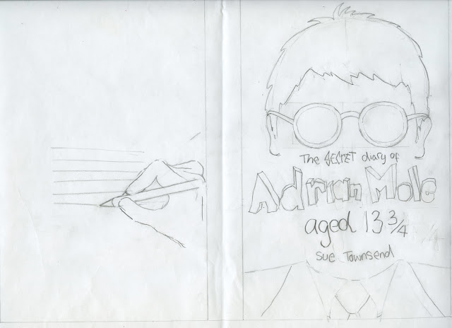
This concept focuses on hiding Adrians face and just showing his hair and glasses.  This idea is about how he only lets his feelings and thoughts about his life, out in his diary and hows thats hidden from his everyday life. The back cover would show his hand as if he is writing the blurb, which is a snap section of the diary. This enforces the point of only letting his true feelings out when a pencil is in his hand. Although I like this idea I feel its a bit floored as Townsend never actually writes that he has glasses, and this actually comes from the tv show, which apparently Townsend didn't approve of at the time. The idea would be illustrated and use bubble writing as if Adrian has wrote it for titles and text. 


2:
This concept is straight foward, depicting Adrians diary as a big deal that no one can ever access. This idea was inspired by the idea of doing an elaborate illustration as if the diary is a treasure chest. The back cover would hint at objects related to the book, the glasses allowing the audience to read the blurb in clear writing with everything else blurred out.


3:
This concept plays on the idea of Adrian having two sides. The 1st being the front cover and using objects that relating to his appearance and everyday living,  growing up as a teen. The back cover would represent his more secretive side, showing the things that frustrate him like dog food and spot cream. As well as his passions for writing poems that he sends to the BBC and letters to Pandora, his crush. The imagery would be done using photography giving the book a much more contemporary feel to it, matched with both bubble and and handwriting in the style of Adrian.


Chosen idea: 3:
I have chosen the 3rd idea as I feel it is most dynamic. The use of photography takes a different approach to how other people may be attacking the project, photography isn't normally used in children's book covers. I feel this idea is the freshest and will attract both parent and child to pick it up. 


Wednesday, 15 March 2017

OUGD406: Book cover initial ideas


Playing on the idea of Adrian getting bullied part of an episode of the tv show I watched.


Excluding his face and using key items in the book pencil/ school uniform/ glasses.


Adrian walking to school taking a look into his imagination, related thing to story.


Looking in the mirror, glasses meaning most of him is blurred like daily life. diary like glasses show true him.


His thoughts are locked away until he can write. Pencil acting as key.


Using key objects in the book and tv show.


Using experiences, shaving and Adrians style to convey themes.


He is a big reader, using book spines and his diary standing out.


Using theme related objects in a nerdy ocd style.


Open school book style with doodles as if he has done them.


Using the his name intwined with glasses.


Playing heavily on the idea of his diary being secret, glasses allowing some things in focus like him.


As if Adrian has written the title on a big wall. 


Lying in bed imagining into the world of love.


Adrian having to deal with his parents splitting up.


Idea of his pencil leading him into an imaginary world.


Head on profile of nerdy Adrian and his uniform on the back.


Adrian thinking he is very smart looking at the mirror as a teen, seeing a man in reflection.


Playing on key aspects of the story, the royal wedding and the street party celebration.


Using bunting across top and related object around title, keep minimalistic.


Showing Adrians paper round, experiences throughout book.


OUGD406: study task 3 book cover typographic treatment

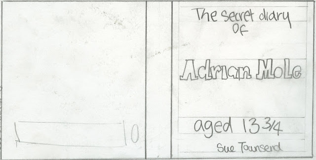
Typographic treatments: Due to my book being a children's novel in a diary style, I feel its appropriate to use a teenagers style hand writing/ bubble writing. This means my typographic treatments aren't very clean and don't use created fonts for the main title.

1: A handwritten style font, on the bottom half of the front cover. This leaves plenty of space for imagery something key to entice a child to pick up the book.


2: Focusing on just typography covering the whole front cover in a bubble writing style, something that all young teens do on the front of school books. 


3: A mixture of bubble writing for Adrians name and handwriting for the rest of the cover. Spaced evenly across the cover allowing space for imagery.


OUGD406: study task 2 book cover analysis

3 book cover analysis:


This original book cover was designed by Caroline Holden.  The light hearted cover straight away conveys a children’s book through the noddy toothbrush but also depicting something to do with teenage life through the use of the shaving equipment. She uses a playful bubble like font, as if the title has been written by drawing it out on the misty mirror. This highlights that you can only see the real Adrian through the secret diary, which shows a clear reflection. The cover suits the book showing the journey he takes through his early teenage years.


This cover was created in 2002. This much more contemporary cover works well. Not showing his face works really strongly showing how engrossed he is in his diary. This reinforces his secret life inside his diary and how he only lets his true feelings and self in his words. Not only this but in also enforces his nerdy side, of him always reading and how he thinks of himself as a mature intellectual. The use of a hand drawn title fits the book as if he has drawn it.


This cover creates a more collage like aesthetic. This is strong showing Adrians creative side through the use of hand painted type for the title. Although this works I feel its almost a bit to childish, as if he painted the title when he was in primary school due to array of colour and pattern he used. Saying this, use of drawn related items to the novel fits this cover and gives the reader an idea of keys themes.