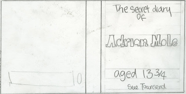
Typographic treatments: Due to my book being a children's novel in a diary style, I feel its appropriate to use a teenagers style hand writing/ bubble writing. This means my typographic treatments aren't very clean and don't use created fonts for the main title.
1: A handwritten style font, on the bottom half of the front cover. This leaves plenty of space for imagery something key to entice a child to pick up the book.
2: Focusing on just typography covering the whole front cover in a bubble writing style, something that all young teens do on the front of school books.
3: A mixture of bubble writing for Adrians name and handwriting for the rest of the cover. Spaced evenly across the cover allowing space for imagery.


No comments:
Post a Comment