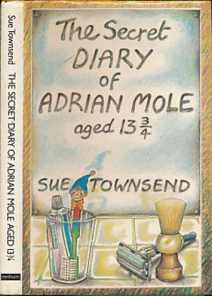
This original book cover
was designed by Caroline Holden. The light hearted cover straight away conveys
a children’s book through the noddy toothbrush but also depicting something to
do with teenage life through the use of the shaving equipment. She uses a
playful bubble like font, as if the title has been written by drawing it out on
the misty mirror. This highlights that you can only see the real Adrian through
the secret diary, which shows a clear reflection. The cover suits the book
showing the journey he takes through his early teenage years.
This cover
was created in 2002. This much more contemporary cover works well. Not showing
his face works really strongly showing how engrossed he is in his diary. This reinforces
his secret life inside his diary and how he only lets his true feelings and
self in his words. Not only this but in also enforces his nerdy side, of him
always reading and how he thinks of himself as a mature intellectual. The use
of a hand drawn title fits the book as if he has drawn it.

This cover creates a more
collage like aesthetic. This is strong showing Adrians creative side through
the use of hand painted type for the title. Although this works I feel its
almost a bit to childish, as if he painted the title when he was in primary
school due to array of colour and pattern he used. Saying this, use of drawn
related items to the novel fits this cover and gives the reader an idea of keys
themes.

No comments:
Post a Comment