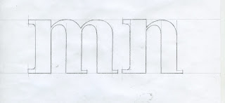
After developing some
ideas that I liked. I then chose the two most liked by people in my interim crit.
From this I went on to develop these to designs through seeing what style of font
they should be in i.e. bold italic, etc. from this I had to make a personal decision
on what font I thought was most functional to represent the word suave. I found
the Helvetica style not nearly as impactful when done using the letters abcde. Even
so, I felt the bold was by far the most successful making the serifs stand out
and give it a sharp personality.
Using Bodoni, I feel
worked really well and create a more fluent letter forms through using more
than one type of serif and manipulating the letters. only keeping the original
contrast between thick and thin strokes.
I chose to take Bodoni
forward as my chosen font. I then went on to do a small mock up of the full alphabet
lower case in this style. It worked really well and letters all worked with
each other.
After I knew fore sure
that this was my final design I took to the drawing boards and drew on a larger
scale all the letters. This allowed me to then scan and use illustrator to
trace over the letters to create the most professional clean aesthetic as
possible.


No comments:
Post a Comment