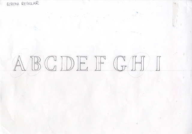
I now have two fonts
to manipulate and make suave. I need to approach making a typeface
methodically. I want the typeface to look clean and sharp whilst also flow and
be sleek. From looking at brands in my research I have an idea of the aesthetic
I want, I decided to experiment with brackets. I first of all researched
different kinds of brackets as well as a range of other previously unknown
typography terms.
I started my
experimentations with a letterform from each font and tried different brackets
combining and playing with what I most felt was sharp and sleek. From this I the
decided to play around with the letterforms changing the size of the bowl and
playing with the stroke thickness to create different tones, some being a lot more
in your face and to impactful for a suave font. From this I combined a
variation of the brackets and different letterforms where most functional. This
automatically gave me several ways to develop other letterforms of the styles
of fonts I created. I did this with both Helvetica an Bodoni.
I decided to apply
these manipulated letterforms to the rest of the alphabet. I felt the most
logical way of doing this was to find out how many fonts there are each typefaces
and split up the alphabet in the different font styles e.g. italic and bold. From
this I then experimented with a different styled letter forms throughout the
alphabet giving me an array of choice, of what bracket and letter form to have
in what style. This will allow me to choose ones I like, to see what the changes
look like on a different letters and to see what suits suave best.
Bodoni alphabet:


No comments:
Post a Comment