I started designing by thinking about the name and branding. I wanted the name to be something easy, catchy and memorable. After mind mapping it, I felt once again focusing on the idea of senses and with already establishing a Scandinavian colour pallet I thought why not translate senses into Norwegian, creating Føle. From this I then started playing around with type to create a logo type for Føle. I played around with trendy serif fonts but decided to go with Circular Std and friendly sans serif font that’s bold but fun. I also needed a smaller text throughout the magazine for written interviews and page numbers. I decided to choose Nunito extralight. This is also and sans serif font. I felt it married nicely with Circular, creating a soft but clear and legible type. After being sent all the files from the designers, which took a lot of chasing up! I decided to start the magazine through the selfies each designer sent me. I asked them to do this as I knew they would feel comfortable doing it and I knew it would create fun images. This was also suitable because I am not in the same country as any of them. I knew I needed to find a way to make these 5 selfies for each designer look unique and fun, as well as consistent throughout. This is when I experimented with different collage styles and ways of presenting the imagery. I thought about different ways in showing the selfies and different ways of marrying the type an images. I ended up using a collage and grain effect across all images with a cut out style. The collages will be in the chosen scandi colour for that particular designer. I then went on to develop the paper tear idea. Matching the colour pallet to the teared paper as well. I knew this would give depth to a lot of the pages and make it feel more of a considered layout. As well as showing the idea of it being a rip out of that designer’s sketchbook. After completing these separate tasks I knew i needed to bring them all together to create interesting, unpredictable layouts for introducing each designer and their work to the magazine. I started tis by sketching out thumbnails for possible layout designs. From previous projects I know how important it is to keep the audience surprised with different layouts. From these sketches I then talked to the designers allowing them to help choose what layout would fit them. I experimented with different types of layouts so to not just stick with the teared paper idea. I thought about different styles of layouts in magazines, and the different ways in which images are presented. After experimenting I still felt the teared paper idea was solid and worked well with the selfies.
Practise Layouts Styles:
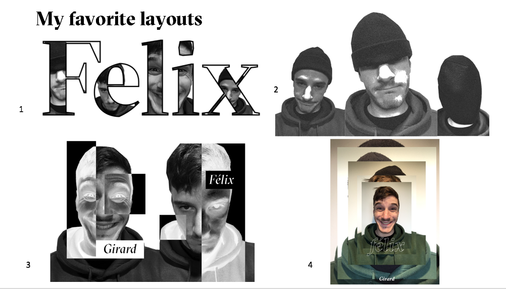
Chosen layouts : Techniques


I started re creating
these thumbnails on indesign using the elements already created. I used a
simple 4 column grid throughout magazine. This allowed for some sections to
follow a simple grid whilst also allowing me to break the grid in other
sections. The name and portrait pages worked well creating a good balance of
negative space as well as the ripped and block colour elements which matched
with the bold friendly type. Similarly, to the name and portrait pages I
created thumbnails sketches for the designer’s work pages. Once again giving
the option to the designers of the way they prefer their work to be laid out.
Throughout these layouts I tried to think about varying the size and position
of images on each page. I want the audience to be constantly surprised some
pages full of imagery whilst leaving some very minimal. Still using a specific
colour for each designers section. I incorporated small details such as page
numbers at the bottom of all layouts, as well as the designers country of
origin and age on the sides of all layouts. I feel the small details bring a
sense of consistency and almost frame the whole magazine. They are the constant
which never changes throughout. At this point I started thinking about the QR
codes. I edited all the audio footage down into the different the different
pieces of work each designer had. I did this instead of 1 long QR code per
person as it then allows the reader the pick and choose which work they want to
listen to. After completing the key content of the book I needed to think about
the final pages. For the contents pages
I wanted something that easily directs the audience with clarity. I felt the
best way of doing this was through the colours allocated the each designer. I
used the white text for the names in each designer’s different block colour.
This gave a nice punched out effect but most importantly created a clear content
that quickly communicated how to get to different sections of the magazine. I
used a similar approach with the thank you page at the back. This is give more
information so people can find out more about them and follow them on socials. Finally,
I moved onto the front and back cover. I wanted to stick with this idea of
ripping and use it within the front and back cover. I came up with some
variation of front cover designs and posed them to the designers in the book.
They helped me decide and make changes to the final cover.


No comments:
Post a Comment