final development:
When creating the
final design, I already had a very good idea of the core aesthetic I was going
to create from previous initial ideas. It was now time to make adjustments to
the chosen designs. With both designs I felt they lacked a sense of character and
personality. These are both key aspects of creating design to appeal to kids,
especially when the product is meant to be a treat. To do this like many kids
food packaging do, I tried to create characters within the base of the design whether
that was the logo type or using background shape. I did this through sketching
and then developing using CAD. I particularly focused on a bright and bold use
of colour to attract consumers. As well as strong loud type to appeal to the
younger market. This is then paired with the use of character or personality to
each design.
For Kind bars I used a
hand drawn logo type, this keeps the feel of the bar informal and fun. I knew
this wasn’t enough to appeal to kids and make the bar stand out. To help
develop the design I focused on incorporating a personality within the
logotype. Through sketching and developing on illustrator I made the decision
to create a smiley face within the N and D. I felt this linked nicely with the
name Kind and didn’t overcomplicate the design. I then went on to focus on the
smaller text for the information. I played around with the idea of using a hand
draw type again. Although this worked I felt the logotype would contrast more
fluently with a thin, legible type. I decided to use Rampung a tall round type
with a friendly feel to it.
For Trek bars I used a
bold strong type, making the bar feel trendy and futuristic. This was then
matched with a centred circle in the background. I felt this would draw the
consumers eyes straight to the logo. Once again the bar lacked a sense of
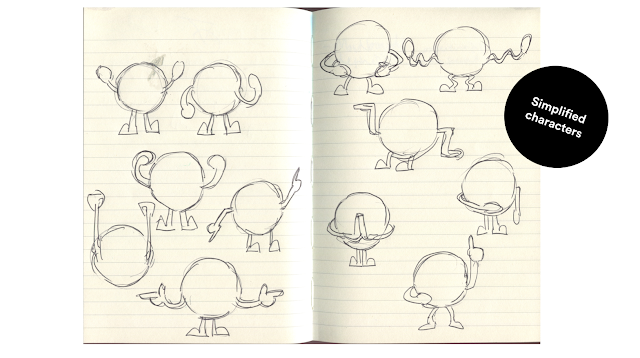
character. I tried to overcome this creating emoji like designs on the
background circle. After experimenting with these I found that simplifying them
to just the legs and arms was enough to create personality, whilst not taking
away from the initial design. I created 4 designs for the different flavours of
the bar, giving each a different personality. This was matched with bright and
vibrant colours to appeal to the young target market. For the information text
I used Futura, this worked well sitting comfortably with Jaapokki, ensuring the
logotype is the centre of attention whilst keeping the information clearly
legible.


No comments:
Post a Comment