Further A1 black ink directional patterns in black letter style:


Using type within the patterns:

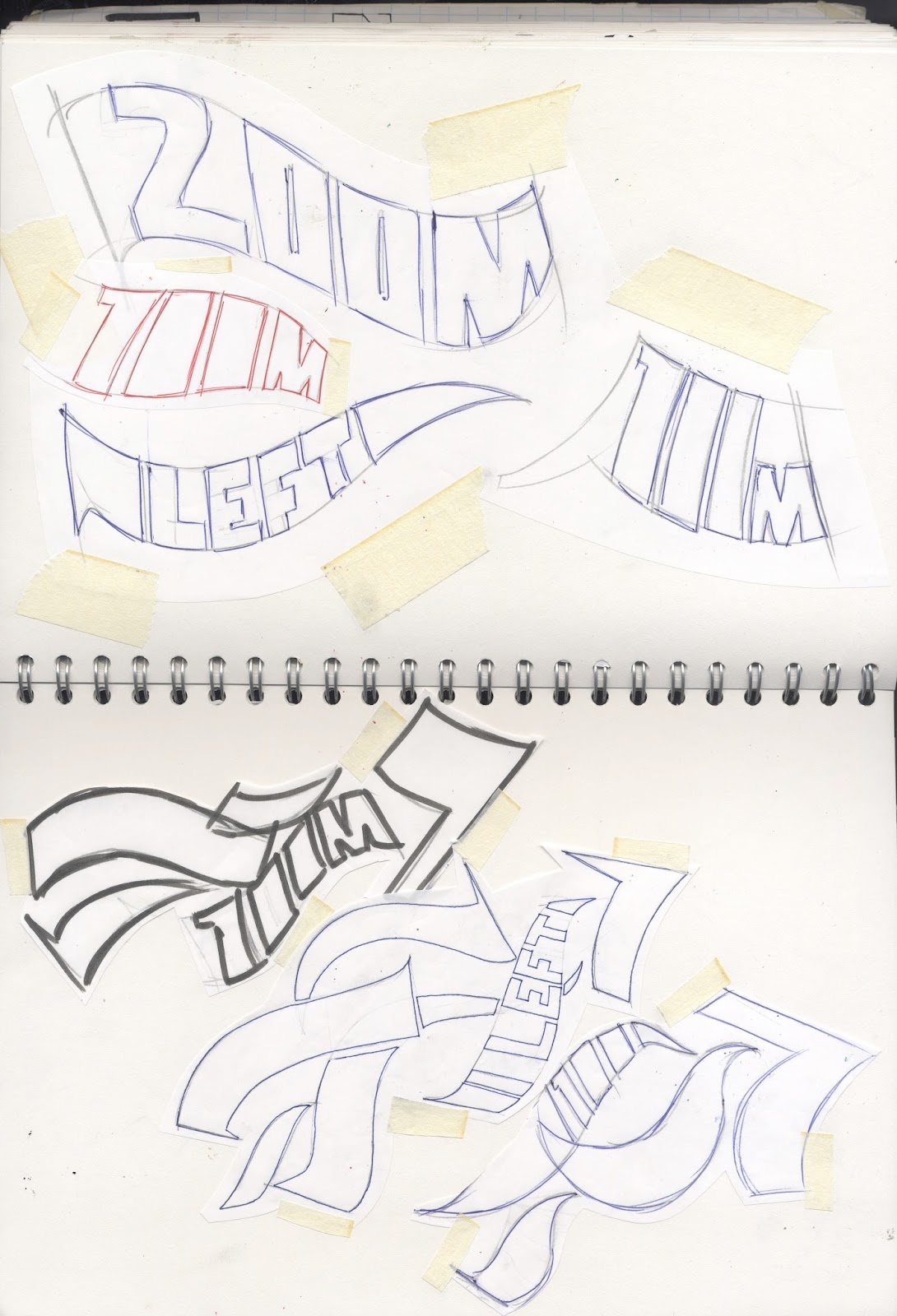

Development text patterns:

Final patterns on illustrator:


Developing icon for showing your location on the route at the street art piece:
As well as this, it was crucial to me to have some kind of symbol at
each art work allowing the audience to know their position along the route. To
do this I also initially wanted to use the black letter marks to show the
shape/ line of the route, and an X to mark the point of the piece. Although
aesthetically I liked the look of the route symbol, I feel it would confuse the
target market and not be clear enough on what the symbol was. To solve this
problem I decided to use a simple line. Instead of the x I experimented with
creating a circle shaped symbol made up of black letter style marks. This use
of black letter mark again creates a sense of unity between the directional
marks and route icon.


Developing icon for your spot on the route:

Final icon:
The route icon to show you were you are along the route, was popular within my crit. My crit and I both felt this part of the project gave clarity and unified the art pieces and the directional marks. This would also be stencil sprayed but on a lot smaller scale next to the chosen pieces.


Final vector drawing of directional patterns:


No comments:
Post a Comment