Taking the spaceship idea forward I needed to consider how the illustration could work in a poster format. At this point I also need to consider how I would apply colour to my print. Looking at a design studios work in Barcelona, called toormix gave me inspiration. They used their vector line drawings and placed them on top of the same imagery just in silhouette format. This created a good way of colouring my poster that fits the process of screen printing and only using two colours.


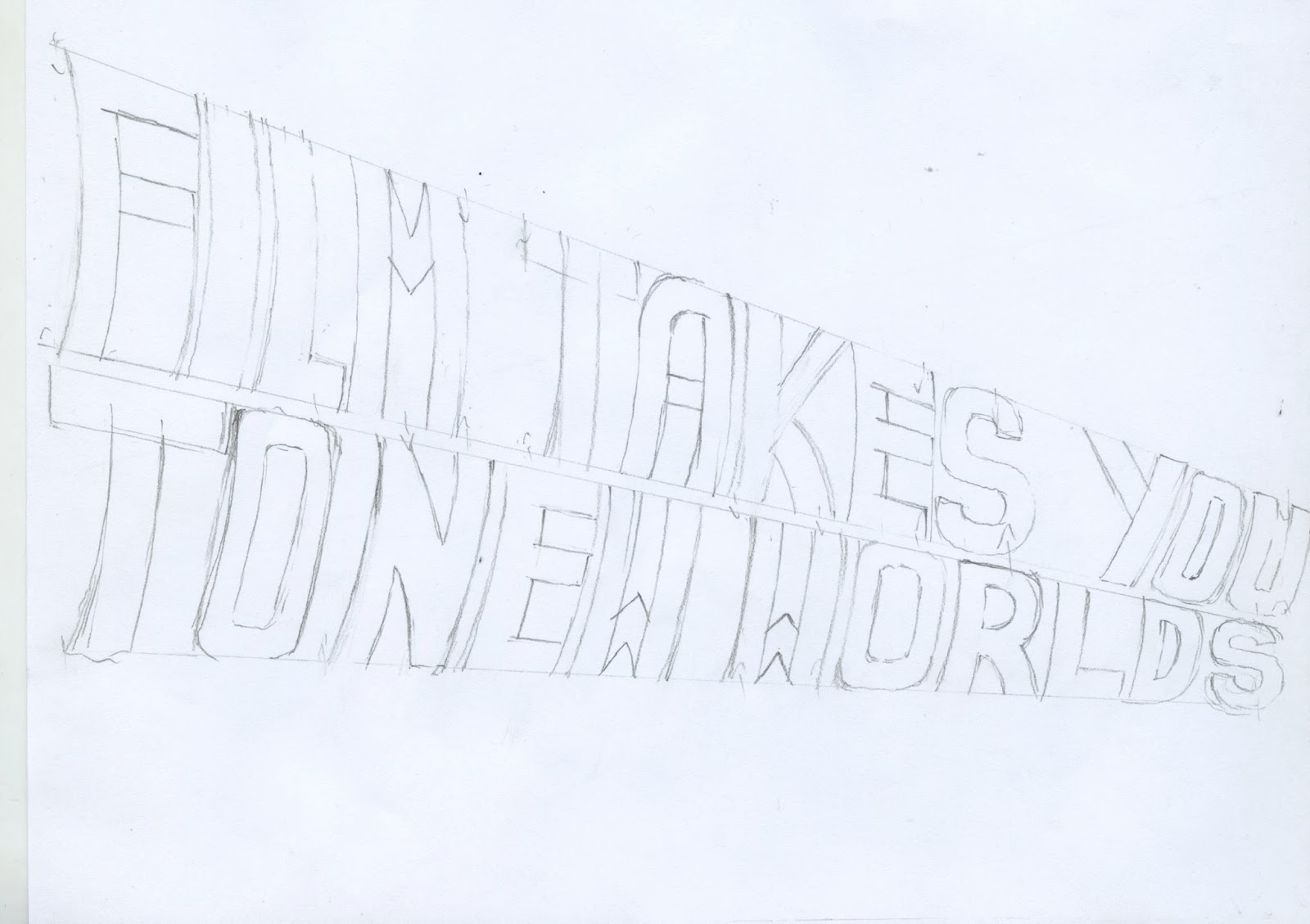
As well as this I also needed to add type. I already new I wanted to text to say ‘film takes you to new worlds’. After discussing how I could approach the text with my crit group, it was suggested I use the style of text used in the famous ‘back to the future’ film. I felt this couldn’t be more suitable. Being an iconic film with iconic type, as well and fitting in with the theme of fantasy.


After creating the final design, I needed to take it into screen printing. I found this process quite challenging and not as straight forward as I had assumed. It required a lot of patience and waiting for things to dry. Although completely worth the wait. I struggled with the first set of prints, the first colour came out quite patchy. This was due to me not cleaning of the emulsion correctly. After re cleaning my screens a couple of times I finally managed to get a decent set of prints. It was then time to move onto adding my second colour. This was also challenging as my design meant I needed to line up the layers carefully to get the required effect. After many attempts I managed to get a couple of prints which I am happy with. Although I still feel I haven’t created the perfectly aligned print.


No comments:
Post a Comment